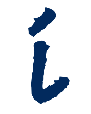
 Government entities aren’t usually known for their interesting logos. Which is why the dynamic logo for the Town of Rindge recreation department really stands out!
The designer who created this logo replaced the letter “I” in the town name with a character whose wide open arms reach to the sky. The figure’s simplicity gives a sense of motion, openness, and energy. From a psychological perspective, there’s nothing more relevant than shape. The human brain is hardwired to understand and memorize shapes. It’s the way we learn things. A distinctive shape is remembered long after we have seen it. One viewer may see this image and think “child jumping on playground” while another imagines an adult reaching for a shot on the rec department’s well-maintained tennis courts. It doesn’t matter as long as the idea of physical activity comes to mind.
That the Rindge recreation department operates a full year-round schedule is implied by the icons representing New Hampshire’s four seasons. Lined up, they also serve to underscore the town name.
By choosing a single color (slate blue), the designer has more control over what people will see when they look at the logo. Within the logo’s rectangular shape, the town name in blue really stands out. And which set of seasons does your eye go to first – spring and fall, or summer and winter? In either case, you get the message that this is not just a small-town summer recreation program.
Opting for a single color can also be used as part of an organization’s branding strategy – if the department had t-shirts, event signage around town, etc. With time people start to associate the color with the brand.
Overall, this is a playful logo for a play-filled location, effective and eye-catching. Kudos!
